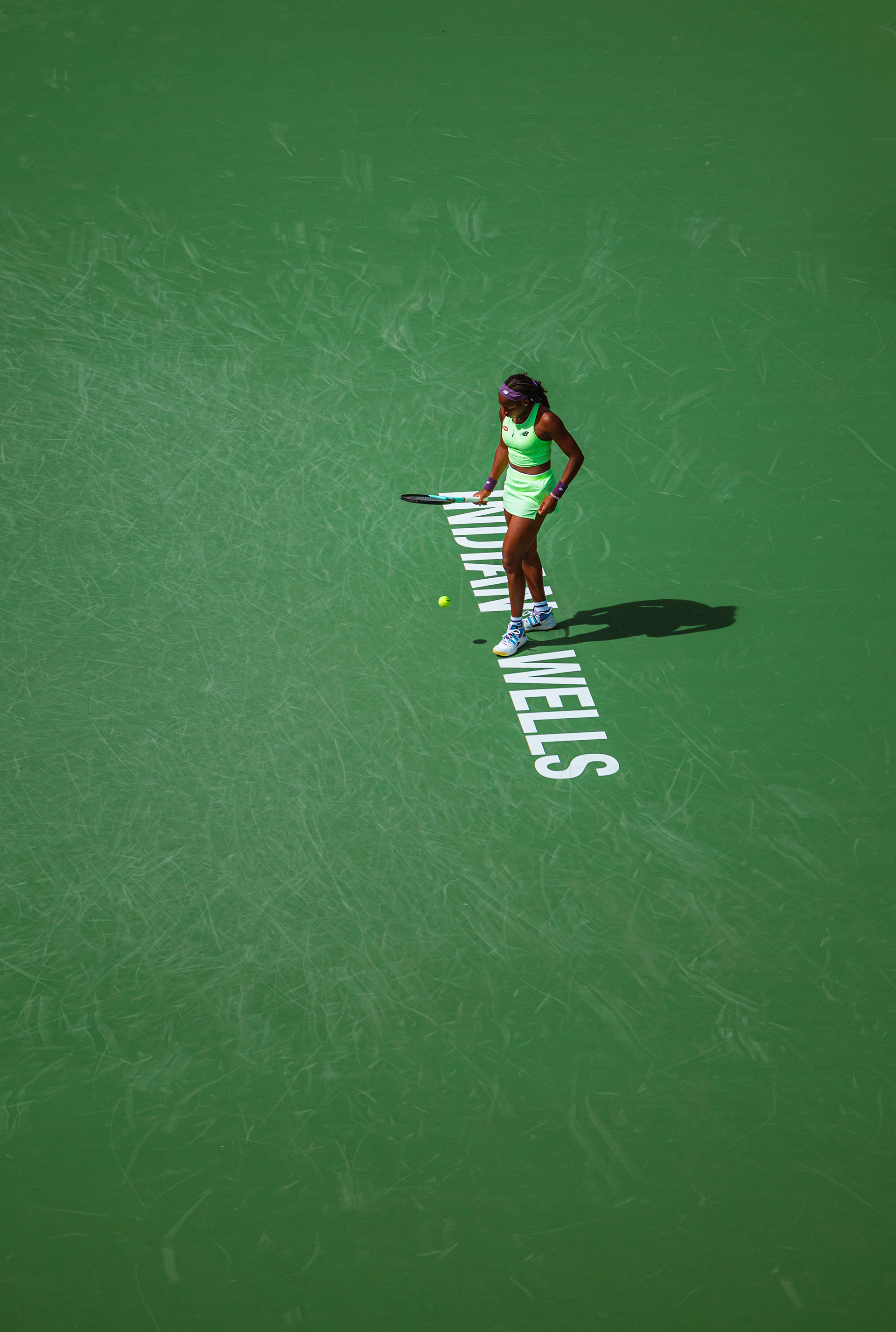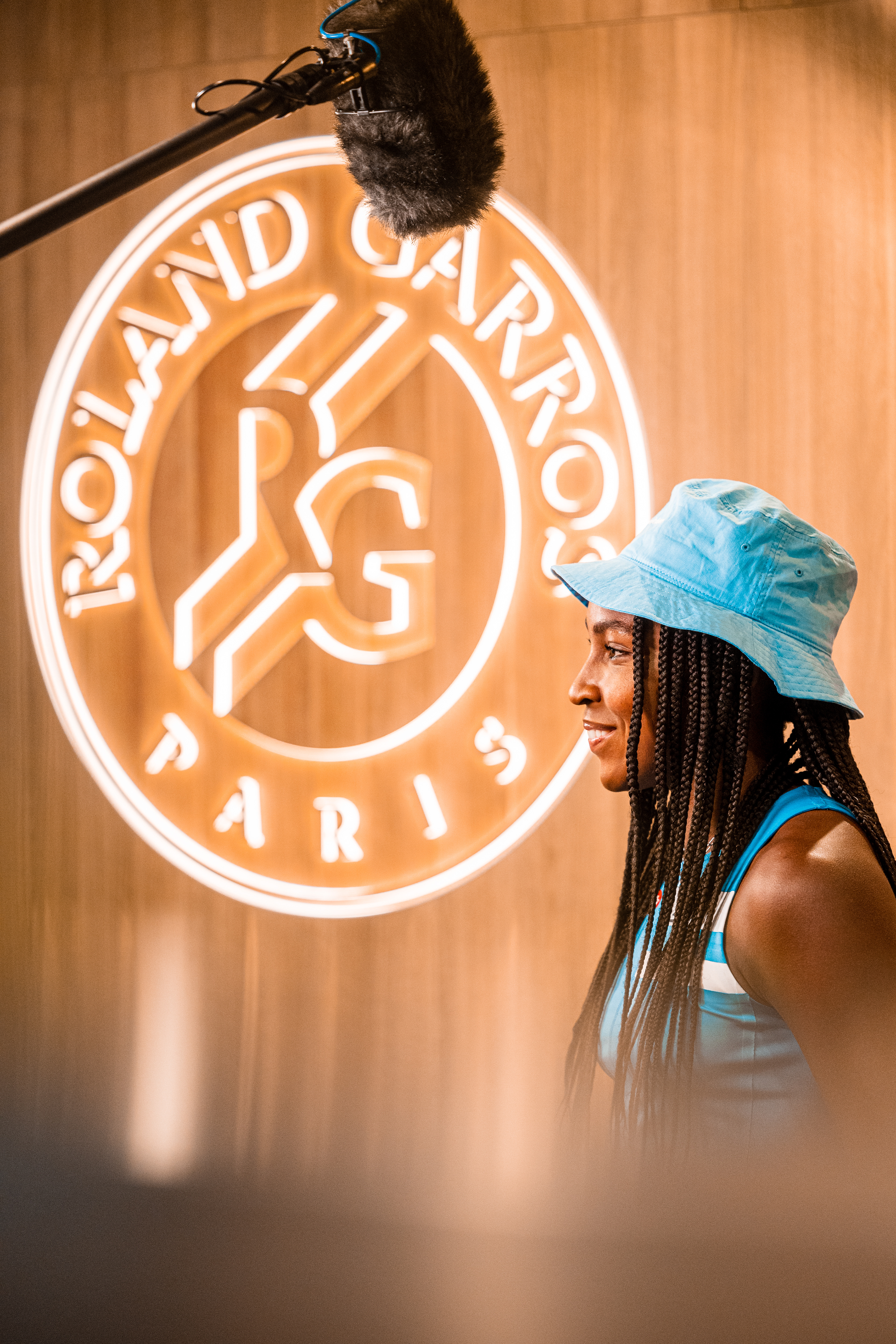
Another facet of composition that can be amazing when done right is the usage of signage. Usually words on backgrounds are an annoying, ugly nuisance. Sometimes, however, everything can lineup beautifully so that the signs, whether they be event names, team logos, or even advertisements, contribute to the image instead of detracting from them.

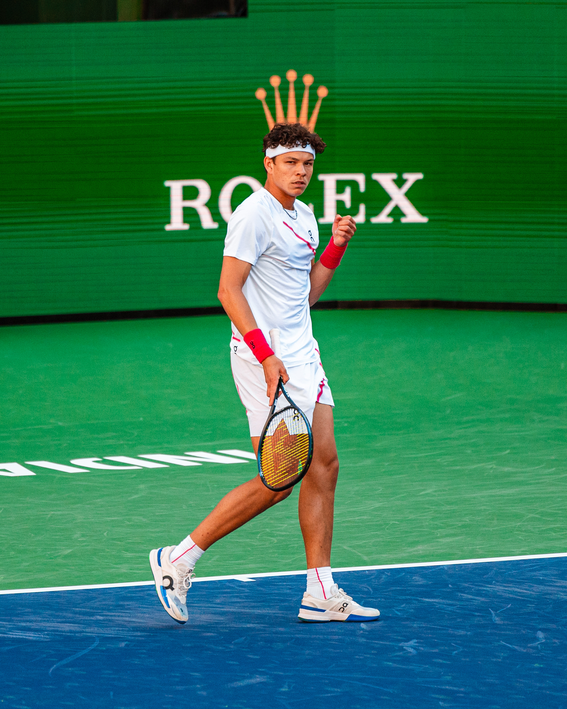
The key is being intentional and creative. It's very difficult to capture these situations on accident. They usually only line up a couple times a match from a specific angle, and if you miss it, it's over. The shot of Ben Shelton, for example, with the Rolex crown over his head, is only visible from a certain point in the lower stands. If you were to stay in the designated media areas for the match, you would never be able to get the shot. Physically, the angles would just never line up. Since I ventured throughout the stands, however, I was able to take advantage of a unique composition, made even better due to the fact that Ben is a newly sponsored Rolex ambassador.
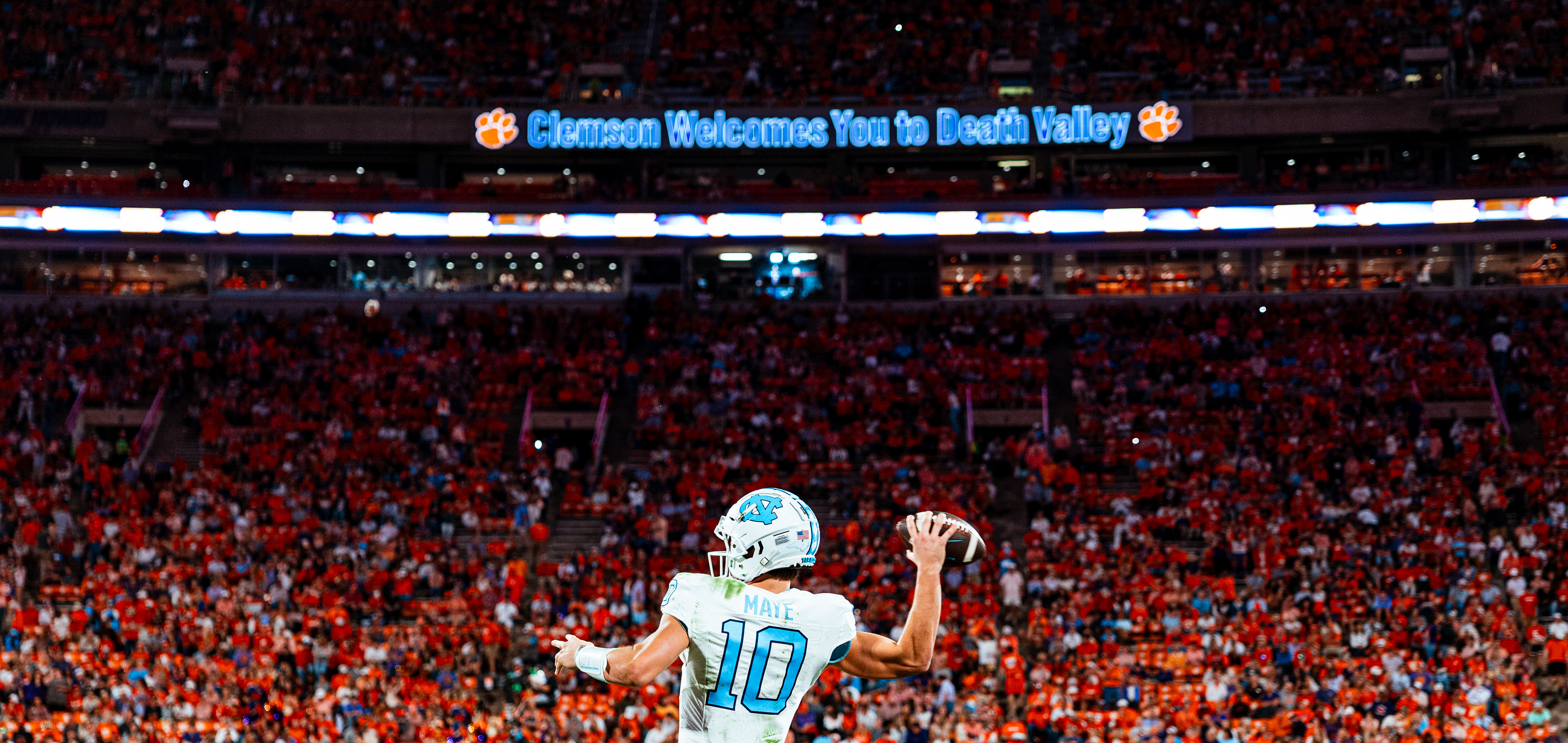
There is no set formula or "rule" for this type of stuff. It is simply keeping an eye out for potential moments to create unique compositions and moments that can tell a story. This picture of Drake Maye, for example. with the width of Clemson's Memorial Stadium and "Clemson Welcomes You to Death Valley" sign, is significantly more impactful than a basic tight shot of Drake and nothing else. Don't get me wrong, we will always need these basic tight shots in sports photography. But sometimes its fun to push the boundaries and think outside of the box, and utilizing signage that would otherwise be overlooked is a great way to do so.