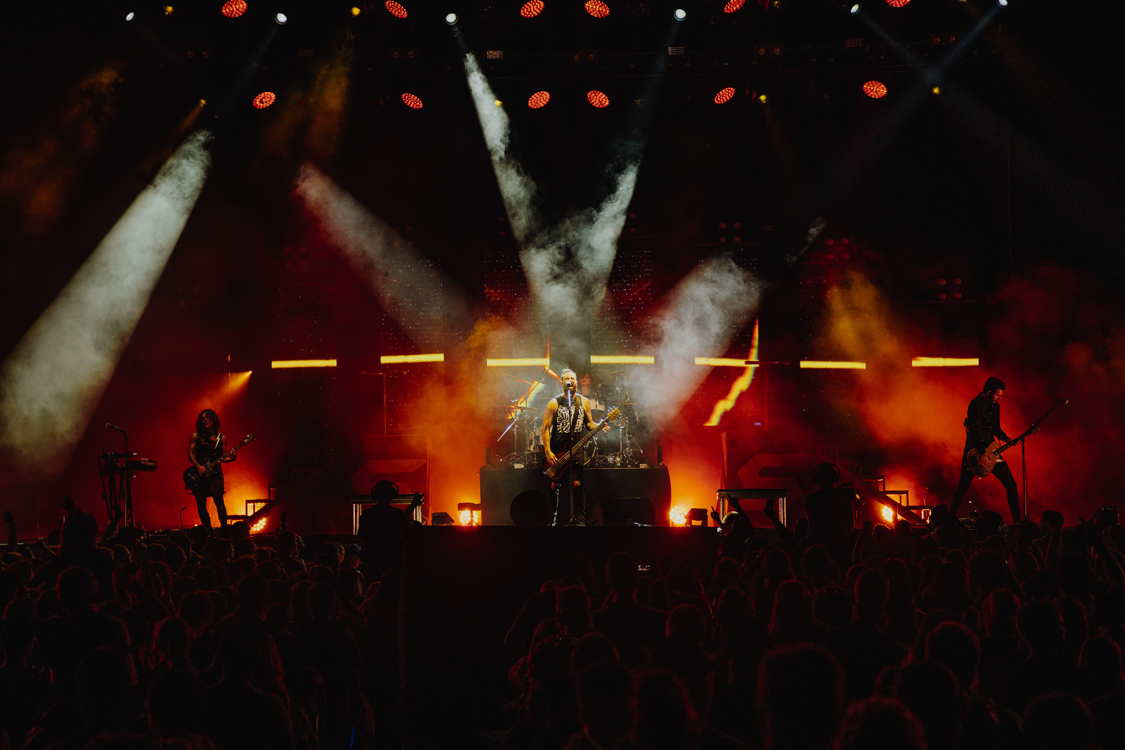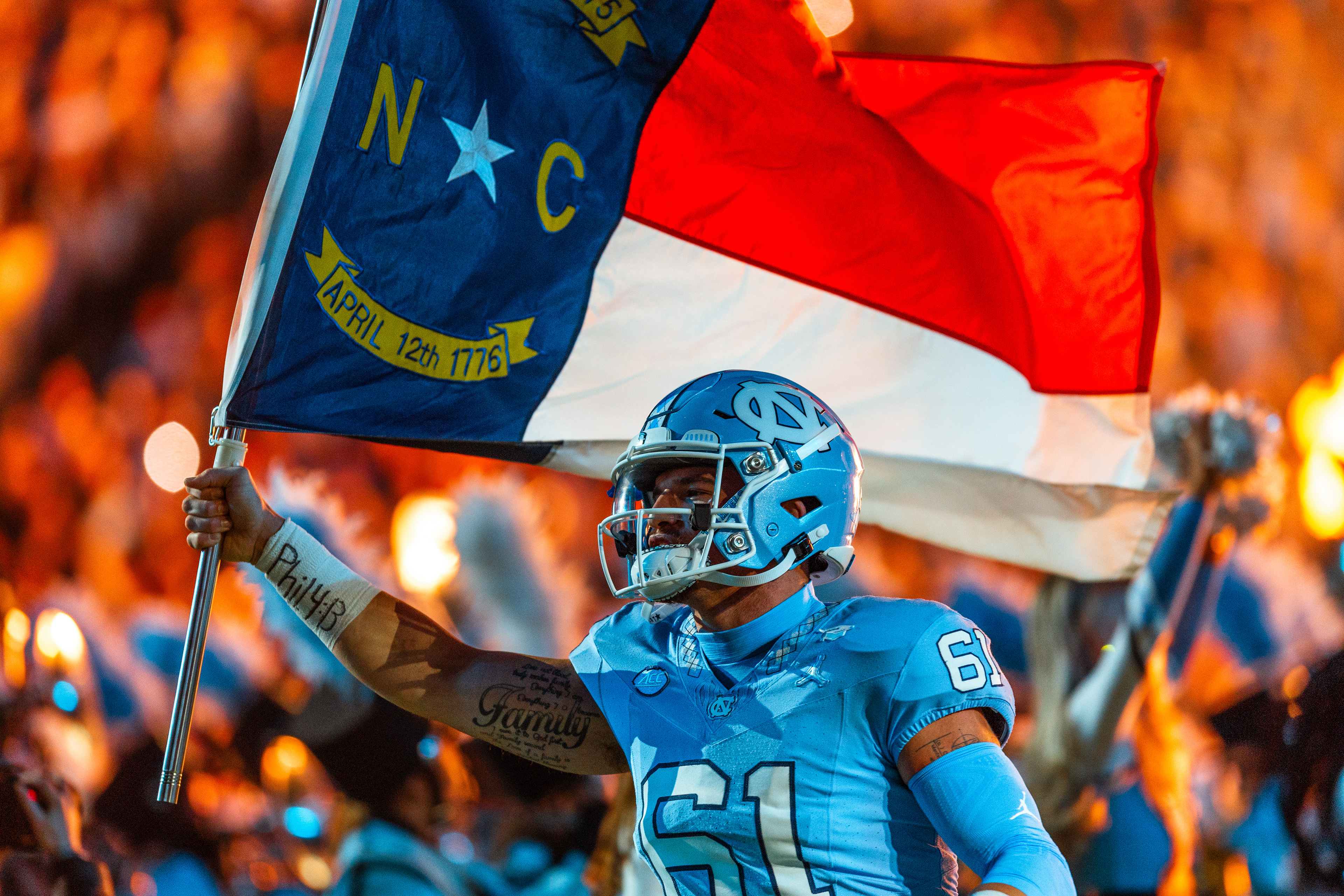
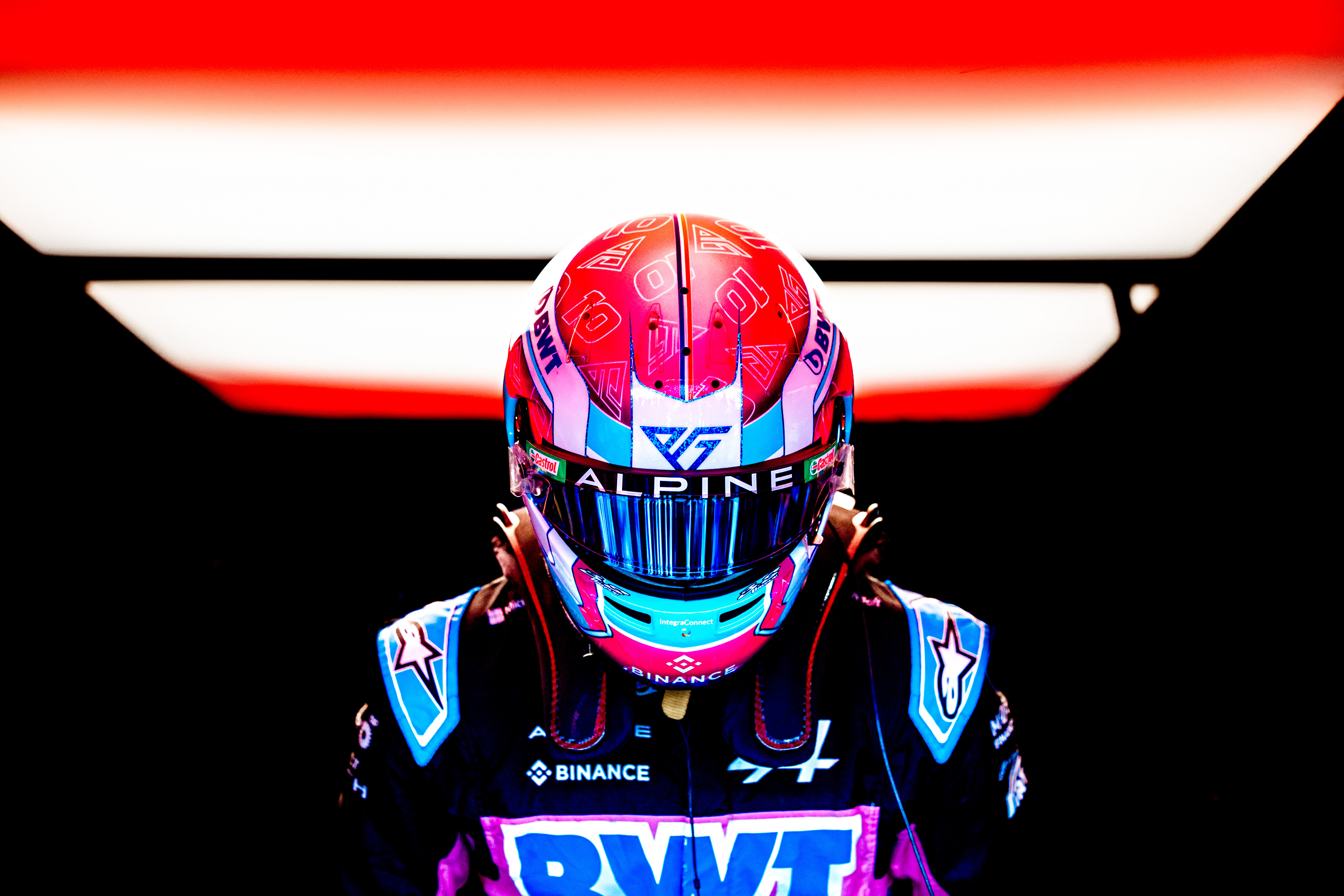
One of the biggest facets to my work is color. I spend a majority of my time editing in Lightroom in the HSL and Grading panels dialing in that specific look, and it's become one of the strongest aspects of my work. It's usually the first thing people notice or comment on. While photography is often viewed as a journalistic endeavor, I've always seen it more as art form. For me, manipulating color is a way of adding an artistic touch.
I love bright, detailed images with lots of saturation and contrast. I like to call it "stylized realism," the idea is to push the image as much as possible without it outright screaming "hey look I am over-edited." The trick is to maintain the integrity of the whites and blacks. As long as "non-saturated" portions of the image remain pure, the picture tends to remain believable even when the colors throughout the rest of the image are intensely manipulated. The shadows are also pushed high to increase detail, while lift is dropped to compensate for an accurate black point.

It's certainly not a look that I came up with myself or a look that's better than anyone else's. I know plenty of amazing photographers who prefer to leave their images untouched, have more muted colors, like to aggressively tint, or any other myriad ways of editing. It is very much subjective, like all art is. Part of one's photography journey is finding their own look.